Research Blog Entry #2
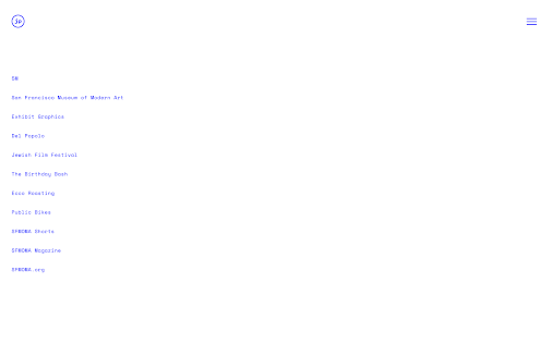
This week's blog post is on the subject of designer James Provenza's website. Like Ellen Christensen's portfolio which I previously posted about. The website is very minimalist upon first loading up. However, upon hovering over different titles of projects, one discovers there is a higher level of complexity of UI at play. The website is still easy to navigate, but the way images and videos respond to user interaction is a lot more lively and animated. I found this to be an excellent example of a modern, yet minimalist portfolio website. I would be really interested in learning how to create a website with similar functions as this one. I also like the variety of work displayed.


Comments
Post a Comment