Posts

Research Blog #7

Image
This week's design inspiration comes from Swiss designer Claude Kuhn . He is known for his creative boxing posters and is the art director and exhibition designer for the Museum of Natural History in Bern, Switzerland. His use of Gestalt principles especially figure ground helped revolutionize poster design during the 80's and early 90's. He received the Swiss Sports Award in '92. The final assignment for my Graphic Design III class is recreating a movie poster. I think I am going to try to do something in a similar simplistic yet bold style.

Research Blog #6

Image
This week's blog is focused on graphic designer Nolen Strals . Initially gaining acclaim for his hand-printed music show posters and facades of landmarks, he has gone on to design book covers, packaging, and even had his work featured in the New York Times. He helped lead the design studio Post Typography for over a decade before taking the role of Associate Creative Director at Telegraph Creative. I first learned about his work after seeing one of his show flyers displayed in Ellen Lupton's book Thinking with Type . After which I decided to find his website and dive deeper into his work. His portfolio boasts a wide variety of impressive projects from wayfinding signage for his hometown of Baltimore to redesigns for large brewing companies and even video and animation.

Research Blog #5

Image
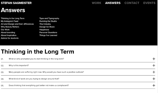
 The website I chose for this week's research blog is that of Stefan Sagmeister , Austrian graphic designer and typographer based in New York. He has done design work for musicians from Lou Reed to Jay Z and Aerosmith. From 2011-2019 he worked with designer Jessica Walsh as Sagmeister & Walsh Inc. I chose Sagmeister's website because he has a very diverse portfolio, yet has many music-related projects consistently placed throughout his site. Though this is not exclusively the type of work I am looking to go into, it is a subject that has always interested me. Another cool section of his website is the "ANSWERS" tab which serves as an FAQ that one might find on any other company's website. However, the questions are all meticulously categorized and the responses have an almost interview/interviewee tone to them. There are questions about Sagmeister's personal design approach, inspiration, and even advice for students. There is a lot to explore on this site

Research Blog Entry #4

Image
For this week's blog entry, I wanted to share a really interesting website a designer at my internship shared with me.  https://www.origins1985.guide/index.html  This site is dedicated to the complete graphic brand identity of First Republic Bank. While on the surface, the idea of a bank as a client may seem somewhat bland, but this site a an excellent example of what's possible when a client with a large budget requests a rebrand. Everything from the UI/UX, web design, and breakdown of the iconography is meticulously crafted. The website as a whole just sucks you in completely.

Research Blog Entry #3

Image
 The website I chose to submit for my 3rd Research Blog Entry is the archive site of Japanese designer Igarashi Takenobu.  https://igarashiarchive.jp/collection/?lang=en  I found out about this designer from a woman whose design studio is next to the office of the company I am interning at. She interned for him in Japan. This is more of an archive than a portfolio site, but it serves a similar purpose of showcasing the truly staggering breadth of his works as a visual artist. from product design and brand identities to sculptures and models. His official website cane be found here:  https://takenobuigarashi.jp/home-en/

Research Blog Entry #2

Image
    This week's blog post is on the subject of designer James Provenza's website. Like Ellen Christensen's portfolio which I previously posted about. The website is very minimalist upon first loading up. However, upon hovering over different titles of projects, one discovers there is a higher level of complexity of UI at play. The website is still easy to navigate, but the way images and videos respond to user interaction is a lot more lively and animated. I found this to be an excellent example of a modern, yet minimalist portfolio website. I would be really interested in learning how to create a website with similar functions as this one. I also like the variety of work displayed. https://jamesprovenza.com/

Research Blog Entry #1

Image
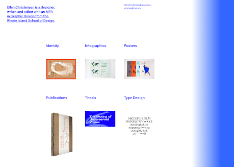
     For my first example of design portfolio inspiration, I chose to start with SFSU Assistant Professor Ellen Christensen's website:  https://www.ellenjchristensen.com/index.html . Having taken her classes Graphic Design I and II, I deeply appreciated the underlying emphasis on how to present and speak about my work in relation to a professional setting.     The work displayed is inspiring, but what stands out to me is the minimalist format and organization of the website itself. It is easy to navigate and all the work is categorized into comprehensible sections. In an era of truly impressive and intricate web design, the elegant simplicity of Ellen's website resonates with me when thinking of how to design my own portfolio.